

The Revenge Trade Trap: How to Stop Letting Losses Control Your Portfolio
You just lost money on a trade. Maybe it was a bad entry, a sudden reversal, or simply bad luck. Now, instead of stepping back, you feel a burning urge to get it back — immediately. You double your position size, ignore your rules, and click the buy button with clenched teeth. Welcome to the psychology of revenge trading.
Revenge trading is one of the most common and dangerous emotional traps in crypto. It turns a small loss into a catastrophic one. But the good news? It’s completely avoidable once you understand the psychology behind it and build a system to protect yourself.
How It Works: The Emotional Loop
Revenge trading follows a predictable cycle:
1. Loss occurs – A trade goes against you, triggering frustration or anger.
2. Rationality fades – Your ego steps in, demanding immediate recovery.
3. Impulsive trade – You enter a trade without proper analysis, often with a larger position size.
4. Further loss – The market doesn’t care about your emotions. The trade fails again, amplifying the pain.
5. Repeat – The cycle deepens as you try to “win back” what you lost.

This loop is driven by a psychological bias called loss aversion — the feeling that a loss hurts twice as much as a gain feels good. Your brain wants to erase the pain right now, even if it means breaking your strategy.
The Setup: Recognizing the Urge
The first step to stopping revenge trading is recognizing when you’re about to fall into it. Watch for these warning signs:
- Your heart rate increases after a loss.
- You find yourself checking the charts obsessively minutes after a losing trade.
- You think, “I need to make that back on the next trade.”
- You ignore your stop-loss or move it to avoid taking a loss.
- You size up to “win back” the loss faster.
If any of these sound familiar, you’re in the revenge trading danger zone. The best action? Step away from the screen.
How to Break the Cycle
Here are three practical strategies to replace revenge trading with disciplined trading:
1. The 30-Minute Rule
After any losing trade, force yourself to wait at least 30 minutes before entering another position. Use that time to go for a walk, drink water, or journal your feelings. This breaks the emotional loop and lets your rational brain catch up.
2. Pre-Defined Loss Limits
Before you start trading, set a daily loss limit — a fixed amount of money or percentage of your account you’re willing to lose in one day. Once you hit that limit, you’re done for the day. No exceptions. This prevents a single loss from snowballing into a disaster.
3. Focus on Process, Not P&L
Shift your mindset from “making money” to “executing a good trade.” A well-planned trade that hits your stop-loss is still a good trade if you followed your rules. The outcome is out of your control; your process is not.
Risk Management: Your Safety Net
Revenge trading thrives when you have no risk management. Here’s how to build a fortress around your account:
- Never risk more than 1-2% of your account on a single trade. This keeps losses small and emotionally manageable.
- Use stop-losses on every trade — and never move them further away out of revenge.
- Keep a trading journal where you note your emotional state before and after each trade. Over time, you’ll spot patterns.
- Have a “cool down” rule — for example, after three consecutive losses, take the rest of the day off.
Remember: The market will always be there tomorrow. Missing one trade is far better than blowing up your account because of one emotional decision.
Conclusion
Revenge trading is a psychological trap that catches every trader at some point. The key is not to avoid losses (they’re inevitable) but to control your reaction to them. By recognizing the warning signs, enforcing time-outs, and sticking to strict risk management, you can turn revenge into patience — and patience into profits.
Trade smart, stay disciplined, and remember: the best trade is sometimes the one you don’t take.
MiCA Rules Make Euro Stablecoins Safe But Uncompetitive, Report Finds
April 27, 2026 — A new report from Blockchain for Europe argues that the European Union’s Markets in Crypto-Assets Regulation (MiCA) has created euro-denominated stablecoins that are ultra-safe but commercially weak, leaving the bloc far behind US dollar-pegged tokens in digital payments and trading. The report, released Monday, cites DeFiLlama data showing euro stablecoins account for less than 1% of global stablecoin volume despite the euro’s much larger role in global markets.
Immediate Details & Direct Quotes
Ready to act on this news? Open an account on Binance — the world’s largest crypto exchange.
The report, drafted by European Central Bank official Ulrich Bindseil and Blockchain for Europe’s Erwin Voloder, focuses on MiCA’s rules for euro electronic money tokens (EMTs). These tokens must be fully backed and are barred from paying interest. The remuneration ban was designed to prevent stablecoins from becoming deposit substitutes, but the authors say it leaves MiCA-compliant euro tokens “at a particular disadvantage” in a positive-rate environment.
“This combination of strict safeguards and zero interest has created a safe but structurally uncompetitive euro stablecoin segment,” the report states. The authors argue that MiCA has pushed euro stablecoins onto the “downward-sloping” part of a regulatory “Laffer” curve, where stricter rules reduce the activity they are meant to govern.
Market Context & Reaction
As of Monday’s report release, euro stablecoins face significant competitive disadvantages versus bank deposits and foreign currency stablecoins that can embed or distribute yield through other mechanisms. The report places these constraints in a broader policy debate over how MiCA compares with other jurisdictions and how Europe should respond.
The euro’s minimal stablecoin market share stands in stark contrast to the dominance of US dollar-pegged tokens, which continue to lead global digital payments and trading volumes. The report’s findings come as regulators worldwide grapple with balancing consumer protection against market competitiveness.
Background & Historical Context
MiCA, the European Union’s flagship crypto regulation framework, was designed to provide legal clarity and consumer protections for digital asset markets. The rules for EMTs specifically require full backing of reserves and prohibit interest payments to prevent stablecoins from functioning as deposit substitutes.
The Blockchain for Europe report represents a significant industry pushback against certain MiCA provisions. The authors argue that while safety is important, overly restrictive rules can backfire by driving activity to less regulated jurisdictions or alternative instruments. The report explicitly calls for reforming MiCA to address these competitive imbalances.
What This Means
In the short term, euro stablecoin issuers will likely continue struggling to gain traction against their US dollar-pegged counterparts. The report suggests that without regulatory reform, the euro may remain a minor player in the stablecoin market despite its economic heft.
For European crypto traders and businesses, the current framework means limited options for euro-denominated digital payments and trading pairs. The report signals growing pressure on EU policymakers to revisit MiCA’s interest ban and other restrictive provisions.
Long-term implications include potential competitive disadvantages for European blockchain projects and fintech companies if they cannot offer yield-bearing euro stablecoins. The report’s authors urge Europe to consider reforms that maintain safety while restoring competitiveness, noting that other jurisdictions are moving ahead with more flexible stablecoin regulations.

The Golden Cross: Your First Step to Riding Major Crypto Trends
Imagine looking at a price chart and seeing two simple lines cross. It might not look like much at first, but in the world of trading, that moment can signal the start of a powerful uptrend. Welcome to the Golden Cross — one of the most well-known and respected signals in technical analysis.
If you’re new to crypto trading, this is a strategy you need to understand. It’s simple, reliable, and has helped traders catch some of the biggest bull runs in Bitcoin and altcoin history.
How It Works
The Golden Cross occurs when a short-term moving average crosses above a long-term moving average. The most common setup uses the 50-day moving average (MA) crossing above the 200-day moving average (MA).
- 50-day MA = Short-term momentum (price action over ~2 months)
- 200-day MA = Long-term trend (price action over ~8 months)
When the short-term line rises above the long-term line, it tells us that recent price strength is outpacing the broader trend. In other words, buyers are stepping in, and the market is gaining upward momentum.
The Setup
To trade the Golden Cross, follow these steps:
1. Pick your asset – Bitcoin, Ethereum, or any coin with decent liquidity and history.

2. Add the 50 and 200 MAs to your chart (most exchanges like Binance or TradingView have these built-in).
3. Wait for the cross – The 50 MA must cross above the 200 MA.
4. Confirm with volume – A Golden Cross is stronger when accompanied by rising trading volume. This shows genuine buying pressure.
5. Enter the trade – Once confirmed, you can open a long position.
Pro tip: Don’t jump in the second the lines touch. Wait for a daily or weekly close above the cross to avoid fakeouts.
Risk Management
Even a Golden Cross can fail. Markets can reverse, and fake signals happen. Here’s how to protect yourself:
- Set a stop-loss – Place it just below the 200-day MA or the recent swing low. This limits your loss if the trend turns.
- Position size – Never risk more than 1-2% of your total portfolio on a single trade.
- Take partial profits – Consider selling 50% at a key resistance level, then let the rest ride with a trailing stop.
- Watch for the Death Cross – If the 50 MA crosses back below the 200 MA, exit immediately. That’s the bearish opposite signal.
Remember: The Golden Cross is a trend-following tool, not a crystal ball. It works best in strong trending markets, not choppy sideways action.
Conclusion
The Moving Average Golden Cross is a classic strategy for a reason. It’s easy to spot, rooted in simple math, and has a proven track record in crypto. Whether you’re catching a Bitcoin rally or an altcoin breakout, this signal can help you enter with confidence.
Start by practicing on a demo chart. Look for past Golden Crosses on Bitcoin’s history — you’ll see how often they marked the beginning of major uptrends. Over time, you’ll develop an eye for the setup and learn to combine it with other indicators like RSI or MACD for even better results.
Happy trading, and remember: trend is your friend.
Mastering the Markets: A Beginner’s Guide to Japanese Candlestick Patterns
If you’ve ever glanced at a crypto or stock chart and felt overwhelmed by the zigzagging lines, you’re not alone. But what if I told you that hidden inside those price movements is a story—a story told through simple shapes called candlesticks? Japanese candlestick patterns have been used for centuries to predict market sentiment, and once you learn to read them, you’ll start seeing opportunities everywhere.
How It Works
Candlesticks were developed by Japanese rice traders in the 18th century. Each “candle” shows four key pieces of data: the open, high, low, and close price for a given time period. The body (the thick part) represents the range between open and close. If the close is higher than the open, the body is usually green or white (bullish). If the close is lower, it’s red or black (bearish). The thin lines above and below the body are the “wicks” or “shadows,” showing the highest and lowest prices during that period.
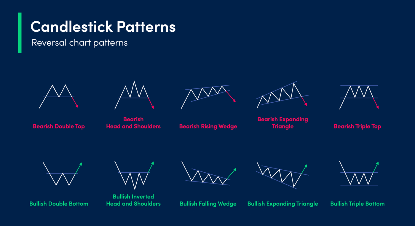
But the real magic happens when you look at patterns formed by multiple candles. These patterns reveal whether buyers or sellers are in control, and whether a trend might reverse or continue.
The Setup
Let’s break down three essential patterns you can start using today:
1. The Hammer (Bullish Reversal)
- What it looks like: A small body at the top of the candle with a long lower wick (at least twice the body length). No upper wick or a very short one.
- What it means: Sellers pushed the price down during the session, but buyers stepped in and drove it back up to near the open. This shows strong buying pressure after a downtrend, hinting at a reversal.
- How to trade: Wait for confirmation—a green candle closing above the hammer’s body. Enter long with a stop loss below the hammer’s low.
2. The Shooting Star (Bearish Reversal)
- What it looks like: A small body at the bottom of the candle with a long upper wick (at least twice the body length). Little to no lower wick.
- What it means: Buyers pushed the price up early, but sellers overwhelmed them and forced the price back down to near the open. This appears after an uptrend and signals potential bearish reversal.
- How to trade: Wait for a red candle closing below the shooting star’s body. Enter short with a stop loss above the star’s high.
3. The Engulfing Pattern (Strong Reversal)
- What it looks like: Two candles. The second candle’s body completely “engulfs” the first candle’s body. In a bullish engulfing, the second candle is green and engulfs a red candle. In a bearish engulfing, the second candle is red and engulfs a green candle.
- What it means: A sudden shift in momentum. For bullish engulfing, buyers overpowered sellers after a downtrend. For bearish engulfing, sellers took control after an uptrend.
- How to trade: Enter on the close of the second candle. Place a stop loss below the low (for bullish) or above the high (for bearish) of the engulfing candle.
Risk Management
Candlestick patterns are powerful, but they’re not magic. Always combine them with other tools like support/resistance levels, volume, or trend lines. Never risk more than 1-2% of your trading capital on a single trade. Use stop losses religiously. And remember: patterns work best on higher timeframes (1-hour, 4-hour, daily) where noise is reduced. Practice on a demo account first to build confidence without risking real money.
Conclusion
Japanese candlestick patterns give you a window into the battle between buyers and sellers. By learning to read these simple formations, you can spot potential reversals and continuations before they happen. Start with the Hammer, Shooting Star, and Engulfing patterns—they’re reliable and easy to spot. As you gain experience, you’ll develop an intuitive feel for market psychology. Happy trading, and remember: every candle tells a story. Listen closely.
Ride the Trend with Confidence: The 200-Day Moving Average Filter
Imagine trying to sail across the ocean without checking the wind direction. You’d waste energy, get frustrated, and likely end up going nowhere fast. Trading without a trend filter is exactly the same. The 200-Day Moving Average (200-MA) is one of the most reliable compasses in crypto trading — it tells you whether the wind is at your back or in your face.
How It Works
The 200-Day Moving Average is simply the average closing price of an asset over the last 200 days. It smooths out daily noise and reveals the underlying long-term trend. When price is above the 200-MA, the market is in a long-term uptrend (bullish). When price is below it, the market is in a long-term downtrend (bearish).
This isn’t a crystal ball — it’s a filter. It helps you avoid buying into falling knives or shorting rockets. By only taking trades in the direction of the 200-MA, you stack the odds in your favor.
The Setup
Here’s a simple but powerful way to use the 200-MA as a trend filter:
1. Identify the Trend: Look at a daily chart. Is price above or below the 200-MA? If above, you’re only looking for long (buy) trades. If below, you only consider short (sell) trades.
2. Entry Trigger: Wait for a pullback or a smaller moving average crossover (e.g., 50-MA crossing above 20-MA) that aligns with the 200-MA direction.
3. Example: Bitcoin is trading at $30,000 and the 200-MA is at $25,000. Price is above — bullish bias. You see a pullback to $28,500 with a bullish candlestick pattern. That’s your entry.
This keeps you from fighting the dominant trend. You’re not trying to pick tops or bottoms; you’re simply riding the wave.
Risk Management
No strategy works without managing risk. Here’s how to protect your capital:
- Stop Loss: Place your stop loss below the 200-MA itself or below a recent swing low (whichever is tighter). If the trend is truly strong, price should not violate this level.
- Position Size: Never risk more than 1-2% of your total account on a single trade. The 200-MA filter reduces false signals, but it’s not perfect.
- Re-evaluate on Breaks: If price closes decisively below the 200-MA (in a long setup), exit immediately. The trend has likely shifted.
Remember: The 200-MA is a lagging indicator. It won’t catch the very first move of a new trend, but it will keep you in the big moves and out of major drawdowns.
Conclusion
The 200-Day Moving Average trend filter is not a get-rich-quick scheme — it’s a disciplined framework. It forces you to trade with the market’s momentum instead of against it. Start by adding the 200-MA to your daily chart today. Let it be the voice that says, “Is this trade aligned with the big picture?” If the answer is no, walk away. If yes, you’ve just given yourself a massive edge. Trade smart, stay patient, and let the trend be your friend.
Mastering Supply and Demand Zones: The Trader’s Guide to High-Probability Entries
Have you ever watched a market reverse perfectly at a level you didn’t see coming? That’s the power of supply and demand zones. Unlike traditional support and resistance, which are single lines, zones represent areas where institutions are actively buying or selling. In this post, you’ll learn how to spot these zones and use them to catch big moves with confidence.
How It Works
Supply and demand zones are rooted in basic economics: when demand exceeds supply, price rises; when supply exceeds demand, price falls. In trading, a demand zone is a price area where buying pressure is so strong that it pushes price up. A supply zone is where selling pressure overwhelms buyers, causing price to drop. These zones form after sharp moves away from a consolidation area—think of them as the launchpad for a trend.
The Setup
To identify a zone, look for a strong, impulsive candle (or series of candles) that breaks out of a tight range. The base of that move—the consolidation before the breakout—is your zone. Mark it as a rectangle, not a line. For a demand zone, the base is below the breakout; for a supply zone, it’s above. Wait for price to return to that zone, then look for confirmation like a bullish or bearish engulfing candle before entering. The key is patience: let price come to you.
Risk Management
Every zone trade needs a plan. Place your stop loss just beyond the zone’s edge—if price breaks through, the zone is invalid. For a demand zone, set your stop below the base; for a supply zone, above it. Aim for a risk-to-reward ratio of at least 1:2. If the zone is strong, you might see price bounce multiple times, but never risk more than 1-2% of your account on a single trade. Remember, zones are areas of interest, not guarantees.
Conclusion
Supply and demand zones give you a clear, institutional edge. Start by marking them on a daily chart, then practice on lower timeframes. The more you observe, the better you’ll get at spotting high-probability setups. Trade smart, stay patient, and let the zones guide your decisions.
Mastering Supply and Demand Zones: The Trader’s Guide to High-Probability Entries
Have you ever watched a market reverse perfectly at a level you didn’t see coming? That’s the power of supply and demand zones. Unlike traditional support and resistance, which are single lines, zones represent areas where institutions are actively buying or selling. In this post, you’ll learn how to spot these zones and use them to catch big moves with confidence.
How It Works
Supply and demand zones are rooted in basic economics: when demand exceeds supply, price rises; when supply exceeds demand, price falls. In trading, a demand zone is a price area where buying pressure is so strong that it pushes price up. A supply zone is where selling pressure overwhelms buyers, causing price to drop. These zones form after sharp moves away from a consolidation area—think of them as the launchpad for a trend.
The Setup
To identify a zone, look for a strong, impulsive candle (or series of candles) that breaks out of a tight range. The base of that move—the consolidation before the breakout—is your zone. Mark it as a rectangle, not a line. For a demand zone, the base is below the breakout; for a supply zone, it’s above. Wait for price to return to that zone, then look for confirmation like a bullish or bearish engulfing candle before entering. The key is patience: let price come to you.
Risk Management
Every zone trade needs a plan. Place your stop loss just beyond the zone’s edge—if price breaks through, the zone is invalid. For a demand zone, set your stop below the base; for a supply zone, above it. Aim for a risk-to-reward ratio of at least 1:2. If the zone is strong, you might see price bounce multiple times, but never risk more than 1-2% of your account on a single trade. Remember, zones are areas of interest, not guarantees.
Conclusion
Supply and demand zones give you a clear, institutional edge. Start by marking them on a daily chart, then practice on lower timeframes. The more you observe, the better you’ll get at spotting high-probability setups. Trade smart, stay patient, and let the zones guide your decisions.
Unlocking the Future: How to Value DePIN Projects Like a Pro
Imagine a world where your smartphone, car, or even your home router earns you passive income. That’s the promise of Decentralized Physical Infrastructure Networks (DePIN). These projects incentivize people to contribute real-world resources—like storage, bandwidth, or sensor data—to a decentralized network. But here’s the million-dollar question: how do you value these projects? Unlike traditional tech stocks, DePIN tokens don’t have P/E ratios or balance sheets. Yet, understanding their valuation is the key to spotting the next 100x opportunity. In this guide, I’ll break down the simple, actionable metrics you need to evaluate DePIN projects like a seasoned pro.
The Strategy Explained
How it Works
DePIN valuation isn’t about guessing—it’s about measuring real-world utility. Think of a DePIN project as a two-sided marketplace: suppliers (those providing resources) and consumers (those paying for the service). The value of the token is tied to the network’s ability to attract and retain both sides. The core metric? Network Revenue. This is the total fees paid by consumers to use the infrastructure. If a project like Helium (for IoT) or Filecoin (for storage) generates millions in annual revenue, the token has a fundamental floor. Compare this to the token’s market cap to get a “Price-to-Sales” (P/S) ratio—a simpler, crypto-native version of traditional finance.
The Setup
To value a DePIN project, start by checking on-chain data dashboards (like Messari, TokenTerminal, or the project’s own explorer). Look for these three key numbers:
1. Annualized Network Revenue: Multiply the last 30 days of fees by 12.
2. Token Supply & Market Cap: Use CoinGecko or CoinMarketCap.
3. Resource Utilization: What percentage of the network’s capacity is being used? (e.g., storage filled, data transmitted).
Now, calculate the P/S Ratio: Market Cap ÷ Annualized Revenue. A ratio under 10 is often considered undervalued for a growing network; over 50 may indicate hype. For example, early Helium had a P/S under 5 before its massive run. Also, check the Revenue per Token: Total revenue divided by circulating supply. If this number is growing month-over-month, the token’s utility is increasing—a bullish sign.
Risk Management
DePIN is still a nascent sector, so risk management is crucial. Here are three rules:
- Don’t FOMO on Hype: A project with a low P/S but zero revenue growth is a trap. Always verify that the network has real users paying real fees.
- Watch for Token Dilution: DePIN projects often reward suppliers heavily with new tokens. High inflation can crush price even if revenue grows. Check the project’s emission schedule on its whitepaper.
- Diversify Across Verticals: Don’t put all your capital into one type of DePIN (e.g., storage). Spread across compute, wireless, and sensor networks to hedge against sector-specific risks.
Conclusion
Valuing DePIN projects doesn’t require a PhD in finance—just a focus on real-world data. By tracking network revenue, P/S ratios, and resource utilization, you can cut through the noise and identify projects with genuine traction. Remember, the best DePIN investments are those where the token’s price is backed by increasing utility, not just speculation. Start small, verify the numbers, and let the network’s growth compound your gains. The decentralized infrastructure revolution is just beginning—don’t get left behind.
Aptos (APT) Leads CoinDesk 20 Gains With 3.5% Rise
Apr 24, 2026 — The CoinDesk 20 Index climbed 0.7% to 2,130.2 since Thursday’s 4 p.m. ET close, with Aptos (APT) surging 3.5% as the top performer among all 20 constituent assets.
Immediate Details & Direct Quotes
Ready to act on this news? Open an account on Binance — the world’s largest crypto exchange.
According to the CoinDesk Indices daily market update published Thursday, all 20 assets in the broad-based index are trading higher. APT led the rally with a 3.5% gain, followed closely by Aave (AAVE), which rose 3.2% from Thursday’s levels. The index itself added 14.28 points during the measurement period.
The CoinDesk 20 is a comprehensive index traded across multiple platforms in several global regions, tracking the performance of major digital assets. The report, released at 4:19 p.m. ET, shows broad market strength across the index’s constituents.
Other notable performers included CRO and XLM, though both lagged behind the broader rally. CRO remained flat with 0.0% movement, while XLM managed a modest 0.2% gain.
Market Context & Reaction
The 0.7% advance in the CoinDesk 20 comes amid a period of mixed sentiment in the broader cryptocurrency market. While Bitcoin has recently stalled below $77,500 with cooling volatility, certain altcoins like Aptos and Aave are showing relative strength.
As of Thursday’s close, the index’s performance suggests selective buying pressure across the crypto ecosystem. The movement represents a continuation of positive momentum, though the gains remain moderate compared to some recent trading sessions.
The strong showing from APT and AAVE indicates investor interest in layer-1 blockchain infrastructure and DeFi protocols, respectively. Aptos, a layer-1 blockchain, continues to attract development activity, while Aave remains a dominant force in the decentralized lending space.
Background & Historical Context
The CoinDesk 20 Index serves as a benchmark for the cryptocurrency market, similar to traditional indices like the S&P 500. It includes major cryptocurrencies by market capitalization and trading volume, providing a snapshot of overall market health.
The current trading level of 2,130.2 reflects the index’s performance since its establishment. The broad-based nature of the index means it captures both established cryptocurrencies and emerging assets.
Recent market dynamics have seen Bitcoin and the dollar move in near-perfect opposition, a trend not seen in almost four years according to separate market analysis. This relationship may influence how investors allocate capital across different crypto assets.
What This Means
The positive performance across all 20 CoinDesk 20 assets suggests broad market stability, at least in the short term. For traders, the strength in APT and AAVE may signal growing conviction in specific sectors of the crypto market.
Investors should watch whether APT’s leadership continues in coming sessions, as sustained momentum could attract additional capital to the Aptos ecosystem. Similarly, AAVE’s 3.2% gain reinforces confidence in DeFi lending markets.
The flat performance of CRO and minimal gain in XLM serve as reminders that not all assets participate equally in market rallies. Diversification across the CoinDesk 20 may help capture broader market trends while mitigating single-asset risk.
As with all market movements, this is not financial advice. Conduct your own research before making investment decisions.
—
ETH/SOL Ratio Trading: A Smarter Way to Play the Layer-1 Battle
Forget trying to predict whether the market will go up or down. What if you could trade the relative strength between two of crypto’s biggest players instead? Welcome to ratio trading, a sophisticated yet accessible strategy that lets you bet on which blockchain ecosystem—Ethereum or Solana—will outperform the other, regardless of the overall market direction. It’s like watching a high-stakes race and betting on which car is pulling ahead, rather than guessing if the race will even finish.
The Strategy Explained: Trading the Relationship
At its core, ratio trading removes the variable of Bitcoin’s price swings and the general market sentiment from your equation. Instead, you focus purely on the relationship between two assets. In this case, we’re looking at the ETH/SOL ratio.
How it Works
The ETH/SOL ratio is calculated by dividing the price of one Ethereum (ETH) by the price of one Solana (SOL).
- Ratio INCREASES: This means ETH is outperforming SOL. Each ETH is worth more SOL than before.
- Ratio DECREASES: This means SOL is outperforming ETH. Each ETH is worth fewer SOL than before.
You’re not betting on absolute price. You’re betting on which of these two Layer-1 giants is the stronger asset relative to the other.
The Setup: Long or Short the Ratio
1. Going LONG the ETH/SOL Ratio: You believe Ethereum will outperform Solana.
- Trade: Buy ETH and simultaneously short SOL (or use a futures/perpetual swap pair if available).
- Win Condition: The ratio goes up. ETH’s price rises faster than SOL’s, or falls slower than SOL’s.
2. Going SHORT the ETH/SOL Ratio: You believe Solana will outperform Ethereum.
- Trade: Short ETH and simultaneously buy SOL.
- Win Condition: The ratio goes down. SOL’s price rises faster than ETH’s, or falls slower than ETH’s.
This paired, market-neutral approach is key. By being both long one asset and short the other, you are significantly less exposed to a general market crash or rally. Your profit or loss comes almost entirely from the difference in their performance.
Risk Management: The Non-Negotiables
While ratio trading reduces directional market risk, it introduces other risks that must be managed.
Pair Risk: Your bet could be wrong. Ethereum might launch a major upgrade that rockets its value, while you’re short the ratio. Always have a clear thesis for why* one will outperform.
- Execution & Funding: If using futures, you must manage funding rates, which can eat into profits if the trade lasts a long time. Ensure you understand the costs of maintaining your position.
- Volatility Decay: In highly volatile markets, the prices can whip around wildly, causing temporary drawdowns even if your long-term thesis is correct. Use sensible leverage or, better yet, trade spot pairs to avoid liquidation.
The Golden Rule: Always use a stop-loss. Decide on a ratio level that, if hit, invalidates your thesis. For example, if going long the ratio at 0.05, you might set a stop at 0.045. This limits your loss on the relationship* trade.
Conclusion
ETH/SOL ratio trading is a powerful tool for traders who have a strong view on the ongoing Layer-1 narrative but want to sidestep the anxiety of overall market conditions. It forces you to think in terms of relative value and ecosystem strength. Start by watching the ratio on your charting platform, develop a thesis based on fundamentals (like upgrade cycles, developer activity, or NFT volume), and always—always—practice sound risk management. It’s not a magic bullet, but it might just be the smarter, more nuanced approach you’ve been looking for in the crypto markets.